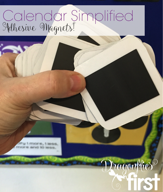
I use a LOT of business card magnets.
I love them. SERIOUSLY. They are the best.
Every poster, anchor chart, label…and well ANYTHING that can go on my white boards gets backed with magnets.
One day after switching over my calendar cards for the new month it occurred to me that using magnets would make things a lot easier and this tedious job a lot faster.
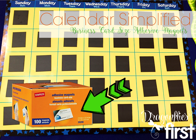
All I did was take some of those adhesive magnets and cut them in half, then stuck them in the daily spaces.
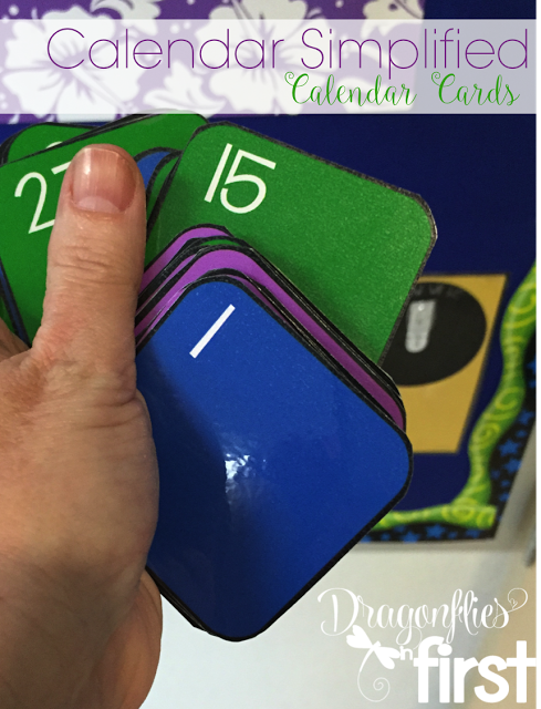
I grabbed all of my laminated date cards and placed half sheets of the same magnets on the back of each of them.

Now, all I have to do to switch out the month is quickly just move the cards around. It seriously takes seconds. They sell these magnets at Staples. You can grab them for even less over at Amazon. Click here to follow my affiliate link to grab them at Amazon.

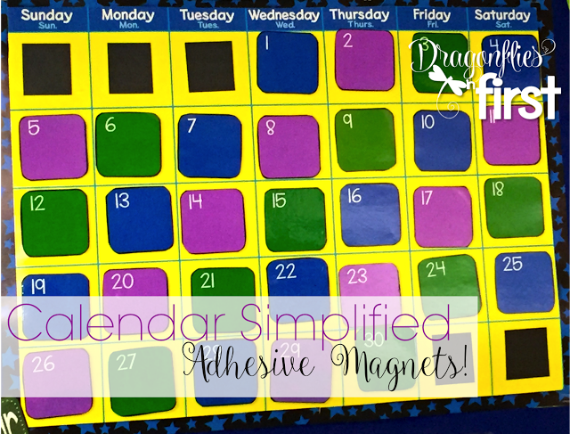
For the various events that happen during the month, I place little event cards over the tops of the dates on which they fall.
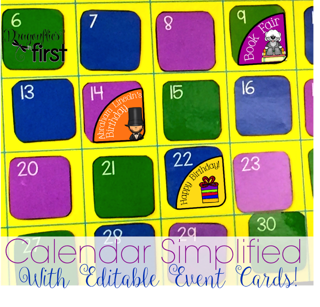
I stick those on with my other favorite thing… Fun-Tak mounting putty! Click here to follow my affiliate link to pick up this AMAZING stuff in Amazon.
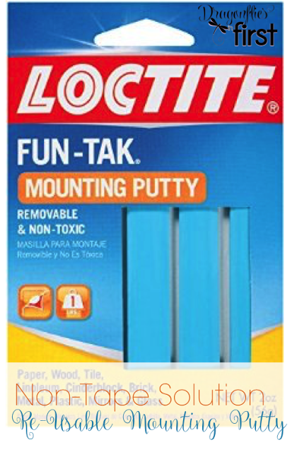
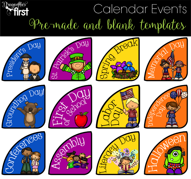
This stuff is AWESOME! It sticks to everything, leaves NO residue, is easily removed AND it’s reusable! Everything that is stuck to a cabinet in my room is stuck there using the blue sticking stuff {thats its official name in my room}. Getting back to those event cards… I decided I needed new event cards for my calendar. I ended up making 36 new cards, plus a set of blank editable ones, too. I LOVE the bright colors.
As I closed out the school year I took a look at many of the labels and things in my room. I thought it was time to change more than just the calendar event cards.
My focus wall was screaming for a change.
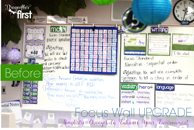
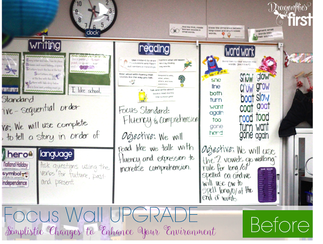
These pictures are actually from a couple years ago . . . but not much is different about that board. Those LARGE headers were really bugging me. They had no “umph” to them! I decided it was time for something a little more modern. What’s more modern than “app” inspired headers?
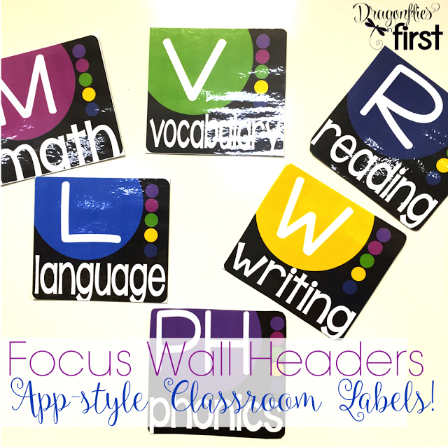
These headers are much smaller than what I had up there, but are brighter and easy to read.
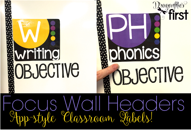
The black and white polka dot lines are made with washi tape. OBJECTIVE is spelled out using 3d stickers. Both the tape and the stickers are from Michael’s.
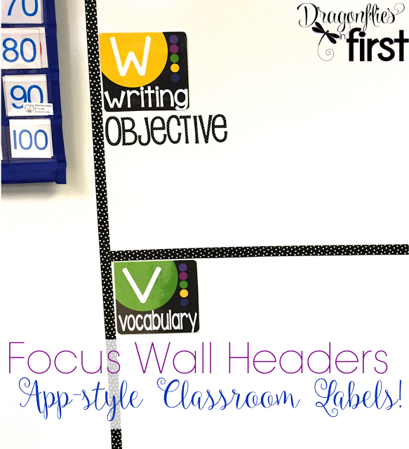
I love how much “cleaner” they look and how they brighten up the space.
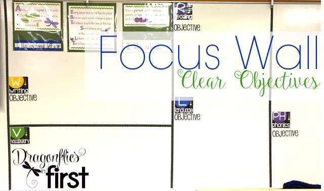
I think the objectives and areas of focus will be a lot more enjoyable to look at with this simple, yet fun, change.
That change led to another change. I felt the base ten/number word cards could use a little update as well.
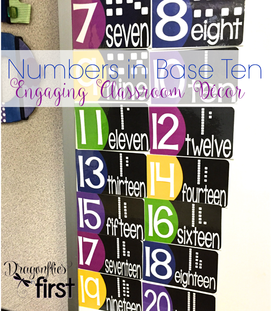
All those bright and bold elements left my month and week cards looking a little sad and old, because, well, they were! NOW they have the same “app” look as my focus wall headers.
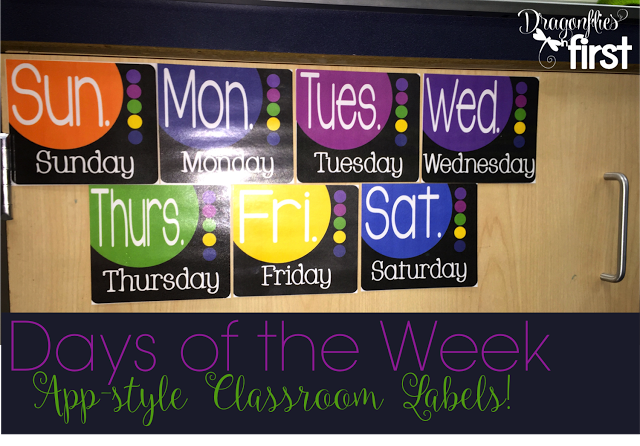
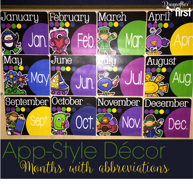
These cards sit below my main white board at the front of the room. The kids refer to them often when they write and during read/write the room. Having the abbreviations on them is a great improvement. I love that they are cute and a helpful tool for the kiddos. Now these essentials are cute and fun to look at, PLUS they add to the brightness in the room.
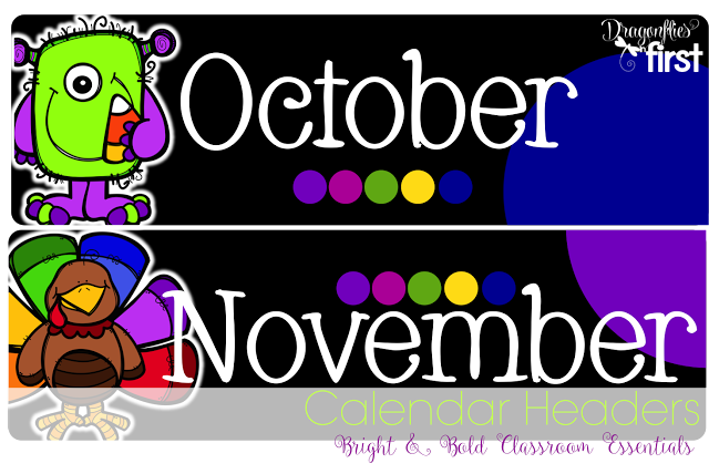
I then decided the Calendar headers could use a similar update. I put the calendar headers above the calendar using that Fun-Tak.
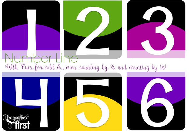
I really like the number line in my room, but thought I should bring some more cohesion into the room by creating a number line that went with the rest of the decor. Like my old number line, this one includes cues for odd and even numbers and/or counting by 2s (the placement of the colorful half circle at the top vs the bottom) and counting by 5’s (all of the 5s have yellow half circles).
In all, my decor overhaul led to a whole lot of fabulous elements that I am super excited about.
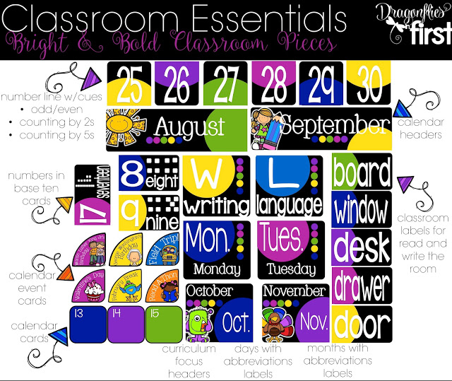
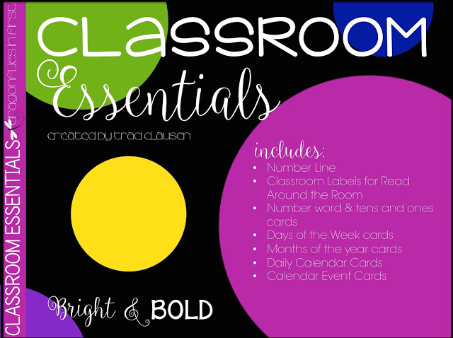
This resource has everything you need to brighten your room. It even has a set of classroom labels, calendar event cards and focus wall cards that are editable so you can create your own. Click the pic to check it out in my store.
